ML Engineering
During the Winter 2021 term, I was fortunate to have the opportunity of working at an AI research division within TD Bank called Layer6 as an ML Engineering Intern. Layer6 had recently been acquired by the bank to satisfy their AI / ML needs. However, Layer6 was able to work very independently and on their own research, kind of like an internal contractor. This acquistion may have limited some of Layer6’s flexibility, but it gave them accesses to much larger resources in terms of data, money and talent.

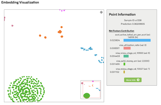
My job within Layer6 was as an ML Engineering Intern. In this role, I was working alongside other developers to create core tools and explainable AI applications to help the Machine Learning Scientists (MLS) with the research, training and understanding of their models. For the term, I was tasked with creating a web application that allowed MLS to view the embedding of their data in an interactive, informative and engaging way. This would allow MLS to visualize how the model is interpreting the data and compare it to their expectations. The application allowed MLS to filter their data, and then view the model’s embedding of that data in an interactive 2D latent space. They could then zoom, pan and click through this embedding space to explore their data. There were additional settings to control the number of clusters, data points, dimensionality reduction settings, etc…

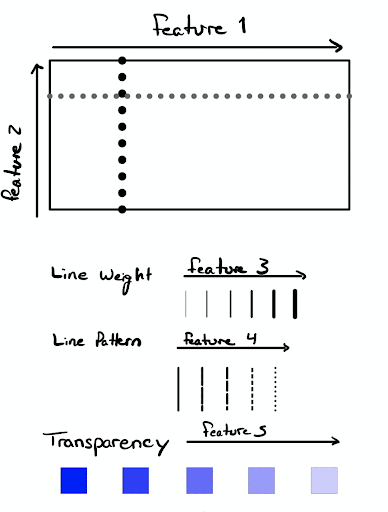
Once the first version of the tool was completed, I got feedback from the MLS. This feedback occurred through eight cognitive walkthroughs in early April. From these interviews, I uncovered that there was a need to have a further understanding of the underlying data and how points relate to one another. Clicking each point and parsing through the information available in the preview area was unintuitive and not as immersive as they had hoped; they needed a way to view the instance’s data within the visualization. This inspired my interviews and a survey for glyph-based feature vector visualization research.
There were 5 major steps involved in the creation of the visualization tool I created: Data collection, embedding extraction, dimensionality reduction, clustering and the visual interface.
1. Data Collection and Inference
The first step involved gathering all of the necessary data from an ElasticSearch instance. This also involved constructing the complicated queries required to fetch the data under several filtering parameters set by the user. These filters included, the data set (training or test), the data range, feature value range, prediction percentile or even a combination of these criteria. Once the data was collected it was passed on into the model to obtain an embedding.
2. Embedding Extraction
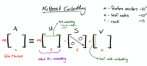
The embedding of the model is a compressed or encoded version of the input data. In neural networks, a hidden middle layer could be used as an embedding. Although, at Layer6 all the models use a gradient boosted random forest structure called
XGBoost. An MLS at Layer6 developed a technique that leverages the physical tree structure of the model and truncated single vector decomposition to create a data embedding for XGBoost models. I first performed this embedding extraction technique to find a data embedding for the visualization tool.

3. Dimensionality Reduction
This embedding technique was able to reduce the dimensions of the input data from over 250 dimensions to 20-50 dimensions. However, to be interpretable to the MLS using the tool the embedding had to be reduced further to two dimensions. To achieve this reduction, I performed the MLS’s choice of t-SNE or UMAP. These two techniques are well established in the industry and use manifold learning to create a non-deterministic mapping of the data from higher dimensions into 2- or 3-D.
4. Clustering
The dimensionality reduction technique naturally reveals clusters based on the geographical layout of the points on the screen but in order to provide an additional layer of information I chose to overlay colour-based cluster information on the data points. The raw data was clustered using the hierarchical clustering technique using the feature values or the SHAP values. The SHAP values are values given to each feature of every instance between 0 and 1 that denotes that feature’s contribution or importance toward that instance’s prediction. Clustering based on SHAP values is a common explainability technique and leads to improved clustering because all the features are mapped to the same unitless feature space. After the clustering, each cluster is assigned to a colour and then the points are coloured accordingly. This added layer of information can help MLS check that the clusters that come from the model embedding align with the clusters formed through colour as a kind of second check. Additionally, the MLS can overlay clustering based on a different feature to verify or reject certain beliefs they have about the model’s interpretation of the data.
5. Visual Interface
After this dimensionality reduction is performed, the data is then sent to the front end where it is displayed using the D3 graphing library. In order to enhance the interactivity, I developed a way to dynamically display the points stored in a k-d tree on the screen as the user pans and zooms. There was also additional information about a cluster or a point available in a preview area to the right of the plot when a point was clicked on by the user.
